Ever wondered how to create gradient borders in CSS that not only look amazing but also allow for a semi-transparent, blurred background with rounded corners? At GoodCode, we recently explored this challenge while designing innovative user interfaces for cybersecurity solutions. Here’s how we tackled it—and how you can, too.
CSS is a powerful tool, but achieving gradient borders with transparency often requires creative problem-solving. We found an elegant approach leveraging modern CSS features like mask and mask-composite. This technique aligns perfectly with glassmorphism—a trending design style known for its frosted glass effect. Here’s a breakdown of the technique and why it’s so effective.
The Goal 🚀
We wanted to:
- Create a gradient border with rounded corners.
- Support a semi-transparent or blurred background inside the bordered area.
The Markup and CSS 🎨
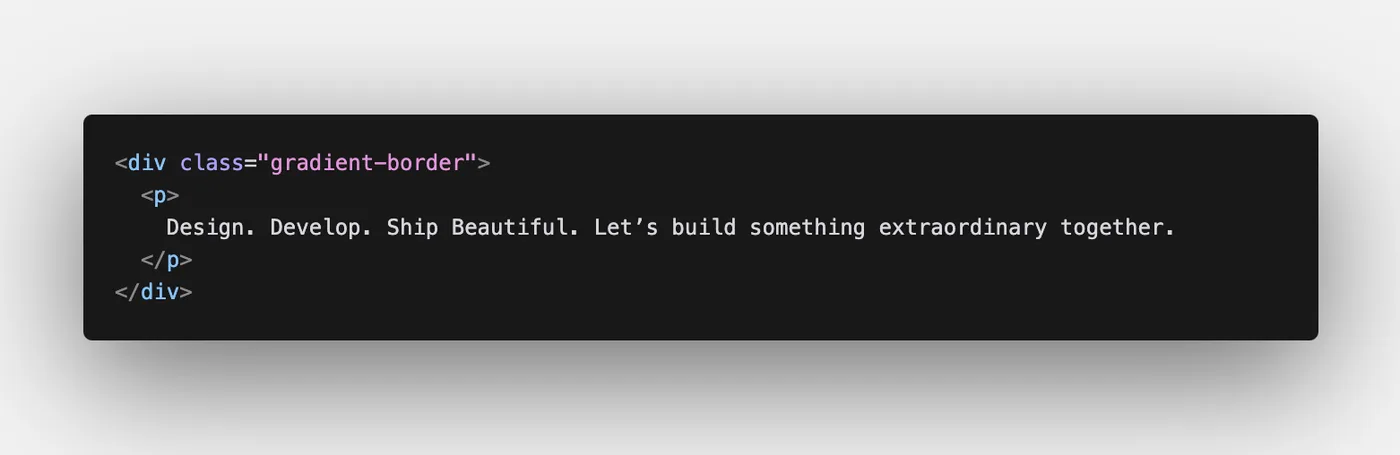
Start with some HTML:
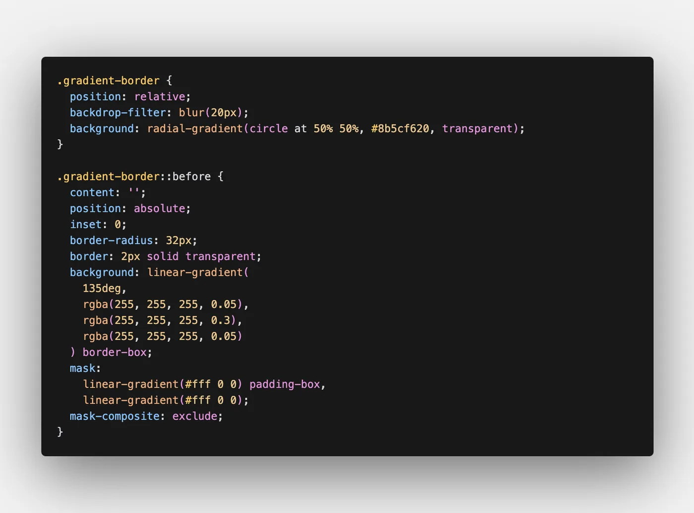
And the accompanying CSS:
How It Works 🛠️
The real magic happens in the ::before pseudo-element. Here’s a step-by-step breakdown:
- Gradient Background as the Border:
- The
backgroundproperty of the::beforeelement creates the gradient. By setting it toborder-box, the gradient extends into the border area while leaving the padding area transparent.
- The
- Masking the Border Shape:
- We use
maskto define a “window” where the gradient shows up. Twolinear-gradients are composited together: one for thepadding-boxand one for the entire element. - The
mask-composite: exclude;rule calculates the difference between these two areas, leaving only the border visible.
- We use
Why It’s Better Than Alternate Methods 🔄
Several other approaches to gradient borders exist, but they come with significant limitations:
Method 1: Using border-image
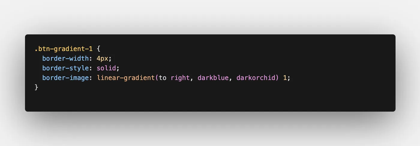
- Pros: Simple and works well for rectangular borders.
- Cons: Does not support rounded corners, limiting design flexibility.
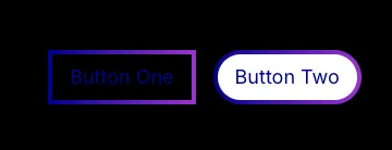
Method 2: Using background-clip
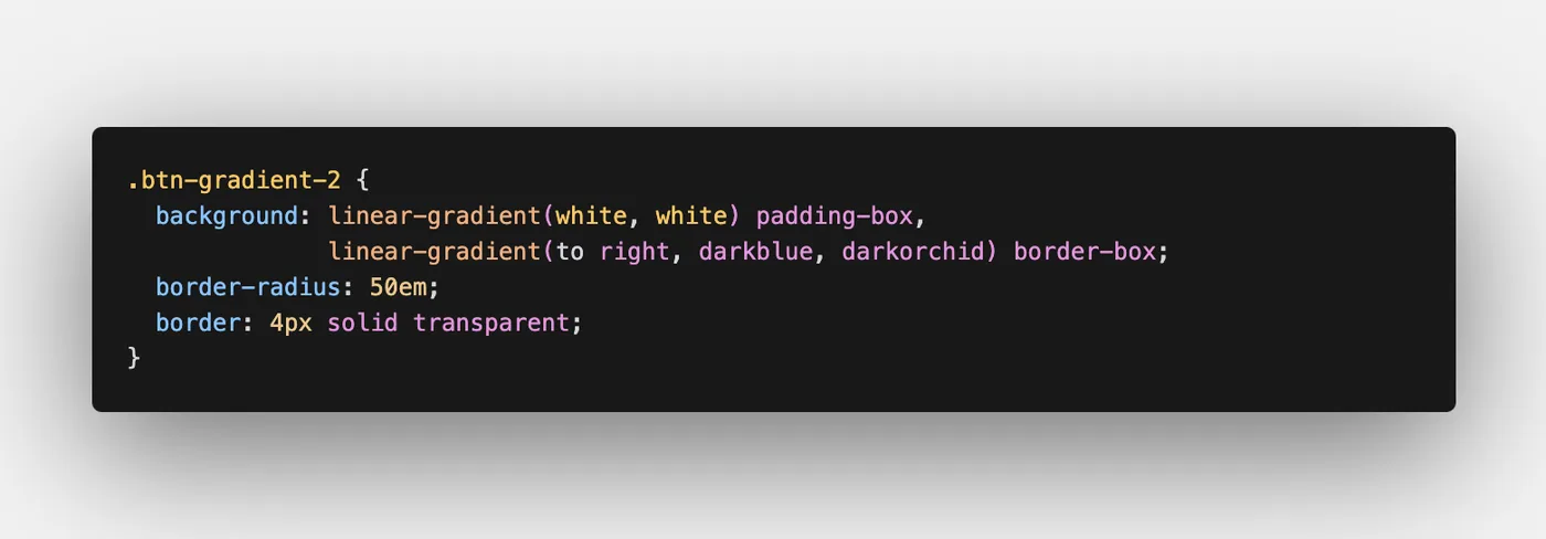
- Pros: Supports rounded borders and simple gradient effects.
- Cons: The inner area must have a solid or opaque background. Transparent or blurred backgrounds are not supported.
Why mask Wins
The mask technique combines the strengths of the above methods without their drawbacks:
- It supports rounded borders.
- It allows for transparent or blurred backgrounds, making it far more versatile for modern UI designs.
- The
mask-compositeproperty offers precise control over the masked regions, ensuring clean, crisp visuals.
Gradient borders with transparency might seem like a small detail, but as we know small details can make all the difference.
Want to see this technique in action? Check out our demo on CodePen and start experimenting.
This post was inspired by Ben Frain’s original blog post: How to create rounded gradient borders with any background in CSS. Many thanks to Ben for sharing his insights! 🎉🙌
About GoodCode
Want to make your users' lives easier but not sure how? At Good Code, we're always happy to help! Our team is dedicated to designing and developing products that prioritize user comfort and satisfaction. We believe in creating solutions that make life easier for users, ensuring they can navigate your platform effortlessly. Whether you need help with UX design, feature implementation, or just some friendly advice, we're here for you. Let’s work together to create a product that doesn’t just cause more error. Visit us at www.goodcode.us to learn more and get started!